Qsource
Qsource is a healthcare quality improvement and information technology consultancy that provides services to healthcare providers, patients, and payers. The company wanted to update its website to better reflect its services, improve user experience, and increase lead generation.
Launch Date
October 20, 2022Objective
When Qsource sought to revolutionize its digital approach, it enlisted the expertise of Hypha HubSpot Development to meet and exceed its ambitious business objectives:
- Enhanced Online Presence & Visibility: Qsource aspired for a significant uplift in its digital presence.
- User Experience & Engagement: Through a comprehensive site revamp and a meticulously crafted content strategy, a state-of-the-art, user-focused website was born, laden with engaging, high-quality content.
- Lead Generation & Conversions: Determined to upscale lead acquisition and conversions, Hypha:
- Rolled out a strategic search engine optimization (SEO) campaign for maximized organic visibility.
- Tapped into the precision of pay-per-click (PPC) advertising.
- Unleashed the potential of email marketing for targeted outreach.
With Hypha’s prowess and Qsource's vision, the outcome was not just an immersive online platform, but a robust mechanism for lead generation and heightened conversion rates.
What We Did
- Logo Design/Branding
- Corporate Messaging
- Website Redesign
- Website Migration
- Blog Migration
- Core Site Content
- Marketing Hub Implementation
- Website Design
- SEO
- Content Creation
- Collateral & Graphic Design
Tech Stack
-
CMS Hub
-
Marketing Hub
-
Sales Hub
-
Service Hub
- Salesforce
Key Features
Fonts, Colors & Layout
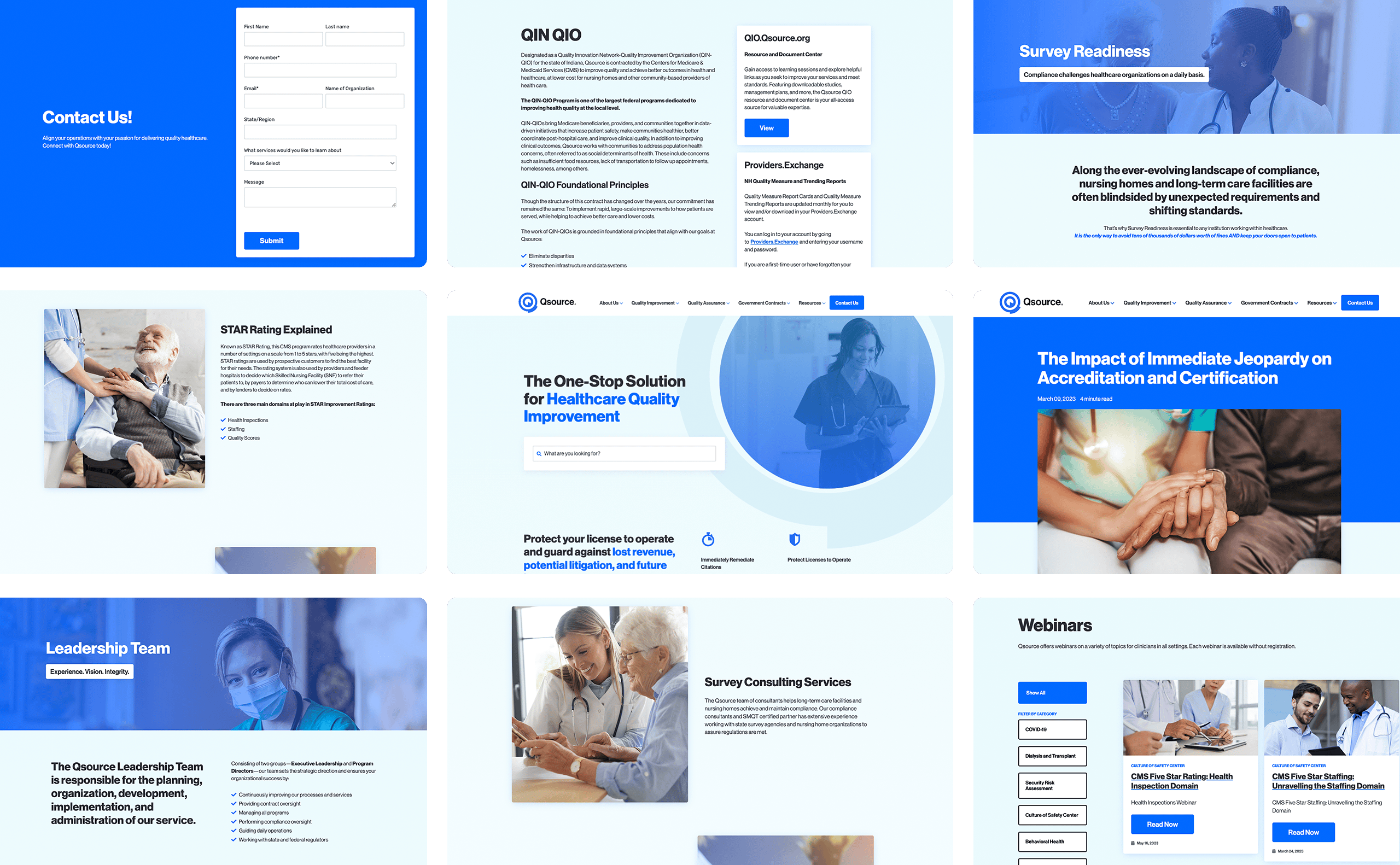
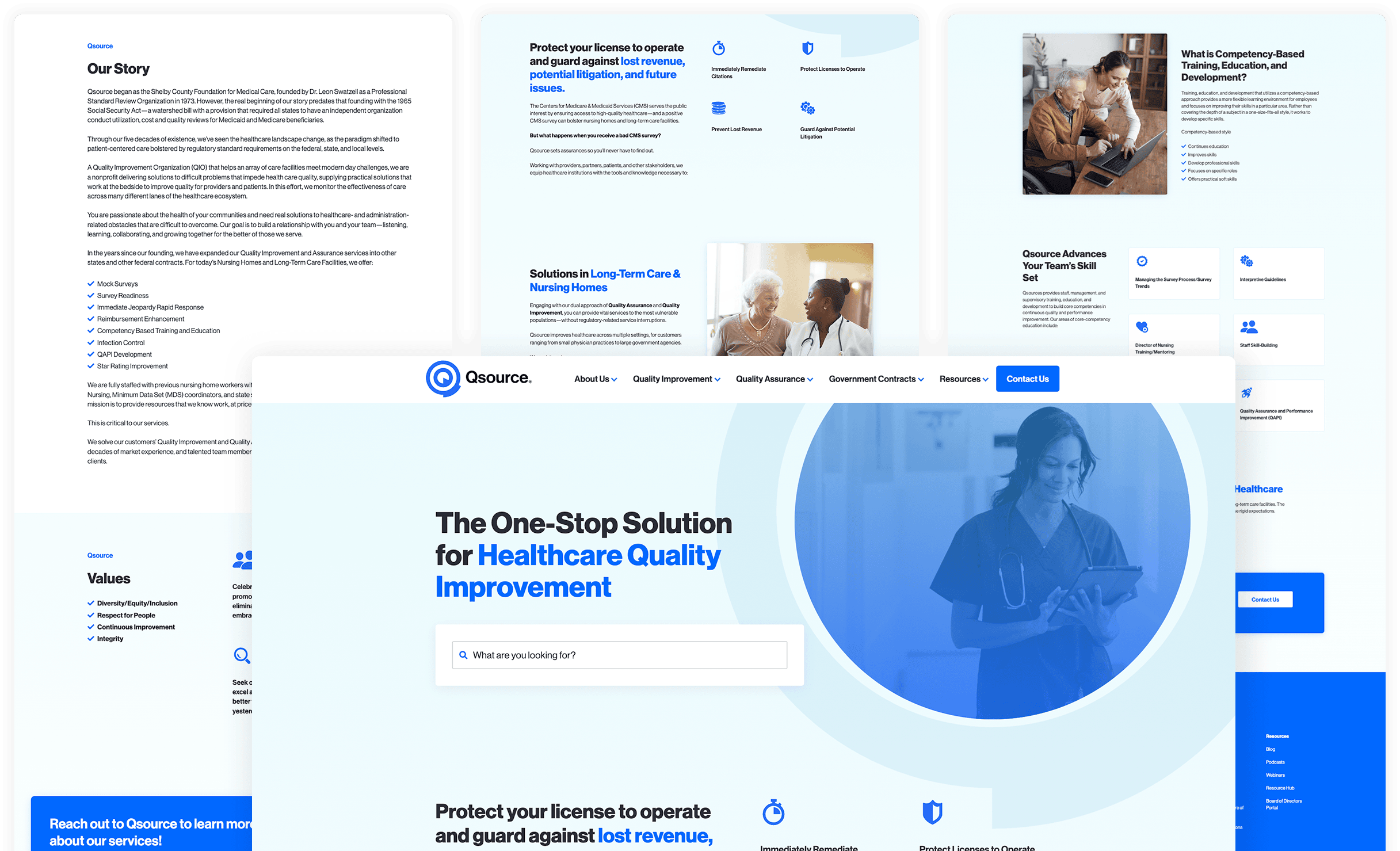
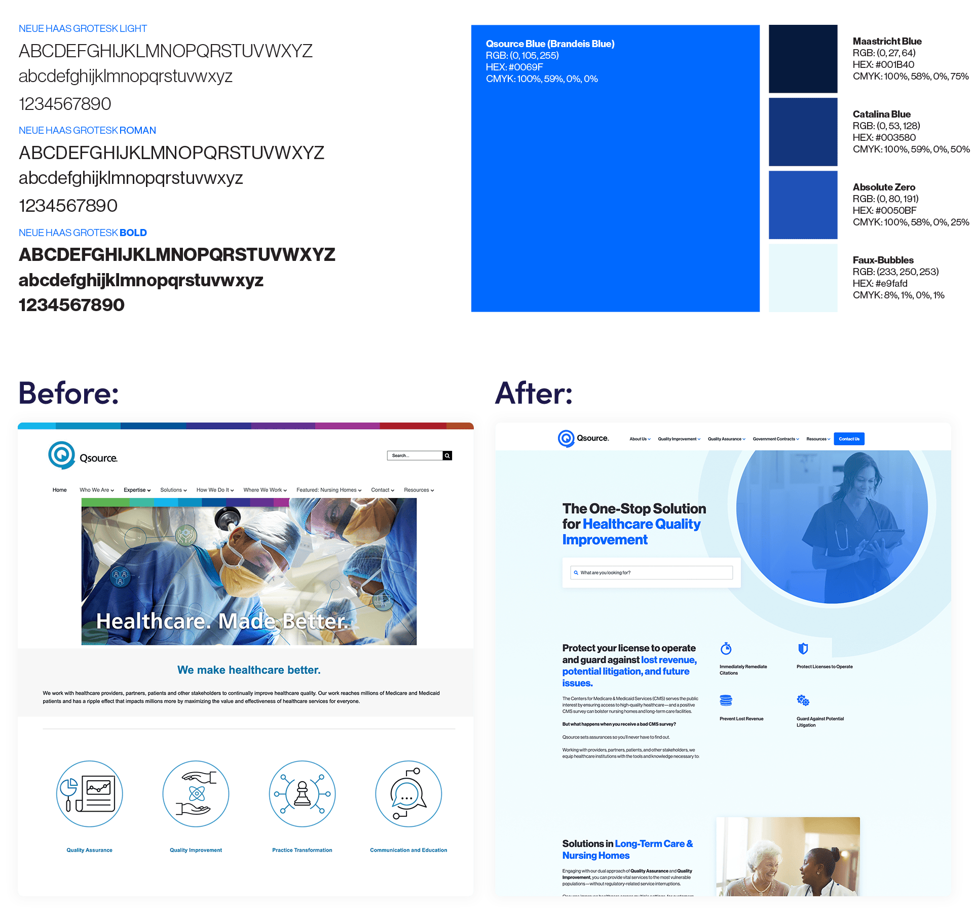
Fonts: One of the initial alterations made by the team was transitioning the website's font from "Arial" to "Neue Haas Grotesk." This contemporary and distinct font resonates more with the brand's visual identity, fostering a more polished and memorable online presence
Colors: Hypha HubSpot Development revamped the website's color palette, introducing a vivid blue (#0069ff) and eliminating a rainbow banner that was found to be diverting. This redesign aims to produce a more unified and purposeful website in line with the brand's marketing aspirations and identity.
Layout: A pivotal change was the amplification of white space within the website's framework. This judicious employment of negative space manifests a sleek, decluttered demeanor, accentuating essential elements such as headlines, imagery, and calls to action. The outcome is a more refined, professional website exuding visual appeal and a user-focused design.
Webinar & Podcast Listing
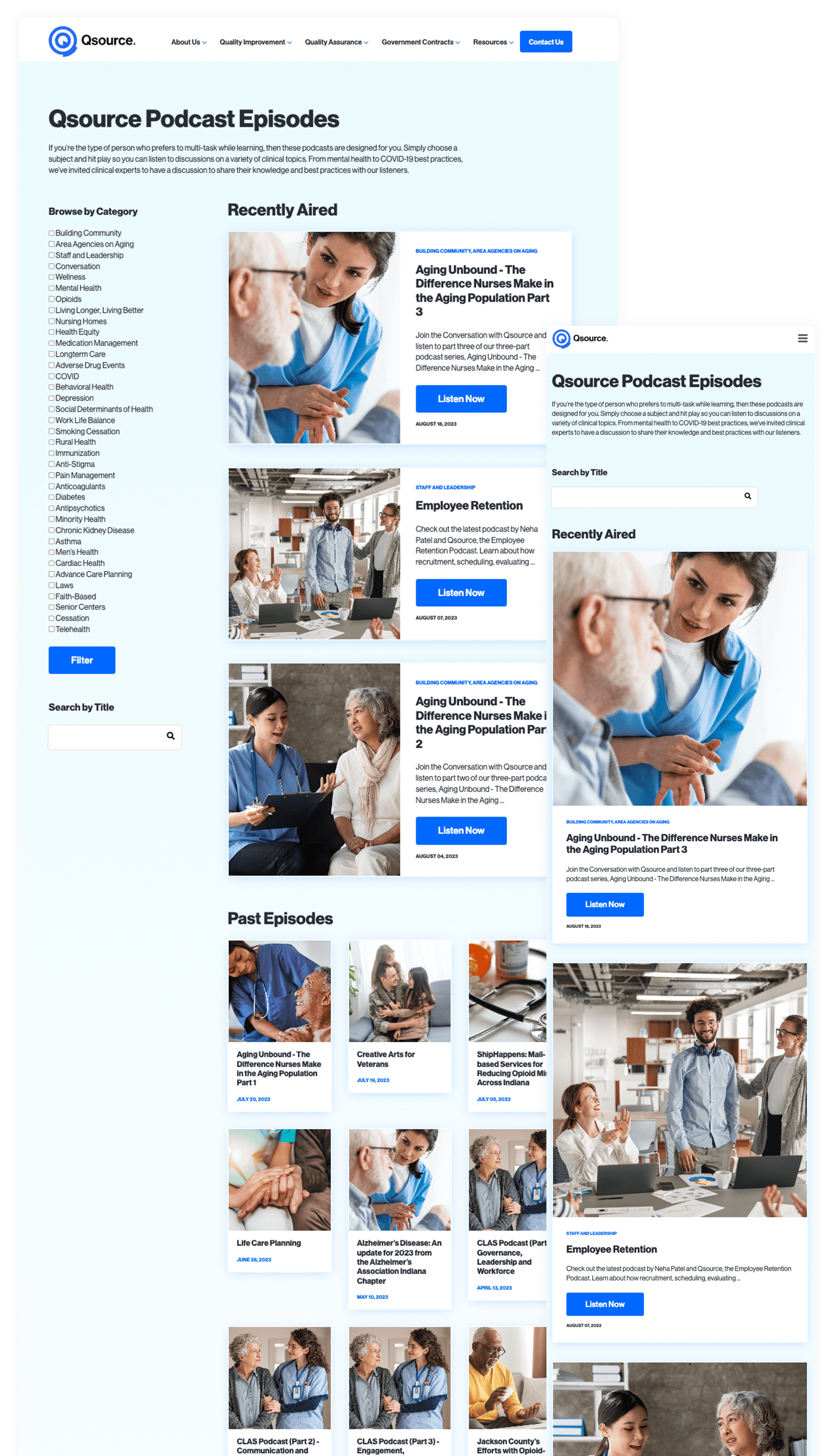
For a superior user journey, Hypha HubSpot Development revamped the webinar and podcast listings, introducing diverse filtering and search functionalities. Leveraging HubDB, they integrated prominent images and a lucid hierarchy. This facelift empowers users to traverse the vast content reservoir effortlessly, ensuring they pinpoint the desired information promptly and efficiently.
Collateral
In a move to boost accessibility, Hypha HubSpot Development introduced larger, legible fonts tailored for elderly patients. This adjustment underscores the website's dedication to inclusivity and broad accessibility, reflecting the brand's allegiance to diversity and equity. With a design that caters to a more diverse audience, the aim is to bolster engagement and foster loyalty among users.Strategic Content Examples
Top Tips to Avoid Immediate Jeopardy
Discover invaluable strategies for healthcare facilities keen on evading immediate jeopardy citations—grave indications of potential harm, injury, or even death to patients. Dive into actionable insights on the essence of quality assurance, meticulous medication record-keeping, comprehensive staff training, and the need for periodic policy evaluations. Emphasizing swift and detailed incident investigations, coupled with robust staff communication and collaboration, the piece underscores how these measures can uplift care quality, ensuring patient safety and sidestepping imminent jeopardy scenarios.
What Happens After an Immediate Jeopardy Citation?
Explore the intricate aftermath a healthcare facility faces upon receiving an immediate jeopardy citation—a stark signal of a looming threat to patient well-being. This blog sheds light on the critical ten-day window within which a correction plan must be submitted, and the possible sanctions for non-compliance. Moreover, it accentuates how the bedrock of quality assurance and performance enhancement can be instrumental in thwarting such dire situations from arising in the first place.
Nursing Home Survey Readiness Checklist To Avoid Immediate Jeopardy
This piece unveils a quintessential checklist tailored for nursing homes, propelling them towards unerring survey readiness. From cross-checking the precision of residents' medication logs to ensuring up-to-date infection prevention measures and adept emergency situation handling by staff—every facet is dissected. With an overarching theme emphasizing perpetual quality improvement, the blog conveys that adherence to this checklist not only augments survey outcomes but also fosters an environment of superior care for all residents.

