If you’ve worked with the HubSpot Design Manager, you’re familiar with the concept of modules that can be dragged and dropped into your layout template. Modules are, essentially, ways to organize content: menus, rich text, images, post listings, and more. But what if you’re looking to create something a bit more customized or advanced? Enter custom modules!
A custom module provides limitless freedom to organize and display content within your template. Using a mix of HubL—HubSpot's Markup Language—HTML, CSS and JavaScript, you can create your own module with its own rules and aesthetic, then easily add it to a web or landing page.
Thankfully, this process isn’t entirely from scratch. HubSpot Design Tools come with field options, enabling you to easily pull in:
- Text content, such as rich text, simple text, dates, and numbers
- Logic content, such as Boolean, and choice conditions affecting how your module behaves
- Other types of content and selectors, including images, forms, files, email addresses, and menus
Learn more about these existing field types on HubSpot’s module documentation.
The possibilities are truly endless. Some common uses for custom modules include:
- Page heroes with responsive backgrounds and/or forms/CTAs
- Accordions, tabbed content
- Sliders or media galleries
- Calendars, press listings, or event listings
- Team or staff listings
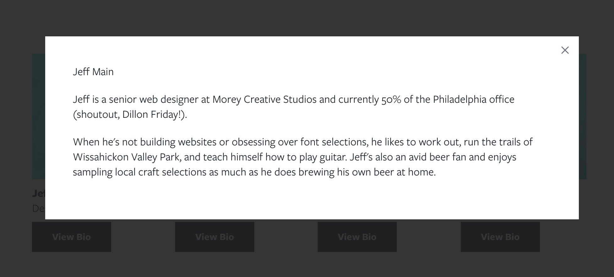
Today we’re going to build that last one—a custom team listing with a pop-up modal. The end result will look something like this:

Step 1. Creating a New Module
First, in the Design Tools editor, go to File > Create New File. Select the folder you'd like this module to live in, such as Custom Modules.
In the modal, select the "Module" icon.
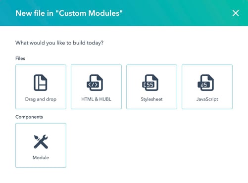
Then, choose where you want this modal to be used, and give it a name. For this example, you can select "Page Templates" and name it "Team Listing With Pop-Up." Click Create!
Step 2. The Base
To start, we’ll need to establish all of the pieces of information we want to display for each team member, and create the field options using the right-hand panel. Click Add Field.
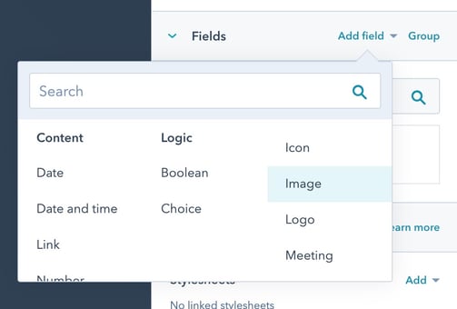
In this example, we’re going to create the following:
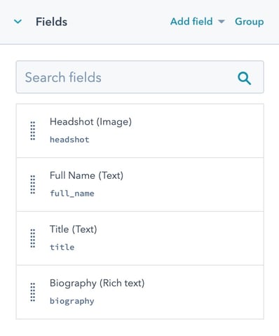
- Image: Name this “Headshot”
- Text: Name this “Full Name”
- Text: Name this “Title”
- Rich Text: Name this “Biography”
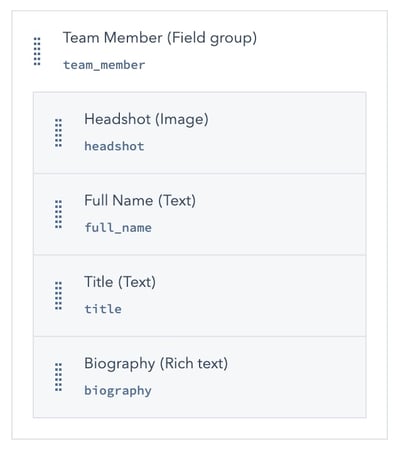
You’ll see HubSpot will automatically create the HubL variable name for each element in lowercase with _ for spaces as you title the element (i.e. typing "Full Name" creates the variable called “full_name”). When you’re done, it should look like this:
Then, we’re going to organize all these together as a Field Group. This will make our module repeatable, so we can display all team members the same way.
- Click Group, then select all four fields, then click the orange “Create Group” button.
- Name the group “Team Member.”
- Scroll down to the Repeater options and toggle the button “On.” (You’ll see you can set minimums or maximums on the repeating options, or sort them using one of your field options, depending on your use case. We’re leaving these settings blank.)
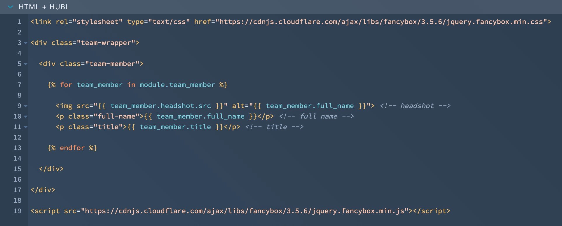
On the left-hand side, in the HTML + HUBL section, we’re going to call our stylesheet and script for FancyBox for the modal window, and set up the basic structure we need.

Step 3. Adding Content
Now we can start to plug in our content by referencing our group and calling our individual field option components. You’ll notice the format looks like this {{ groupname.fieldname }}, and is wrapped in a {% for %} statement.
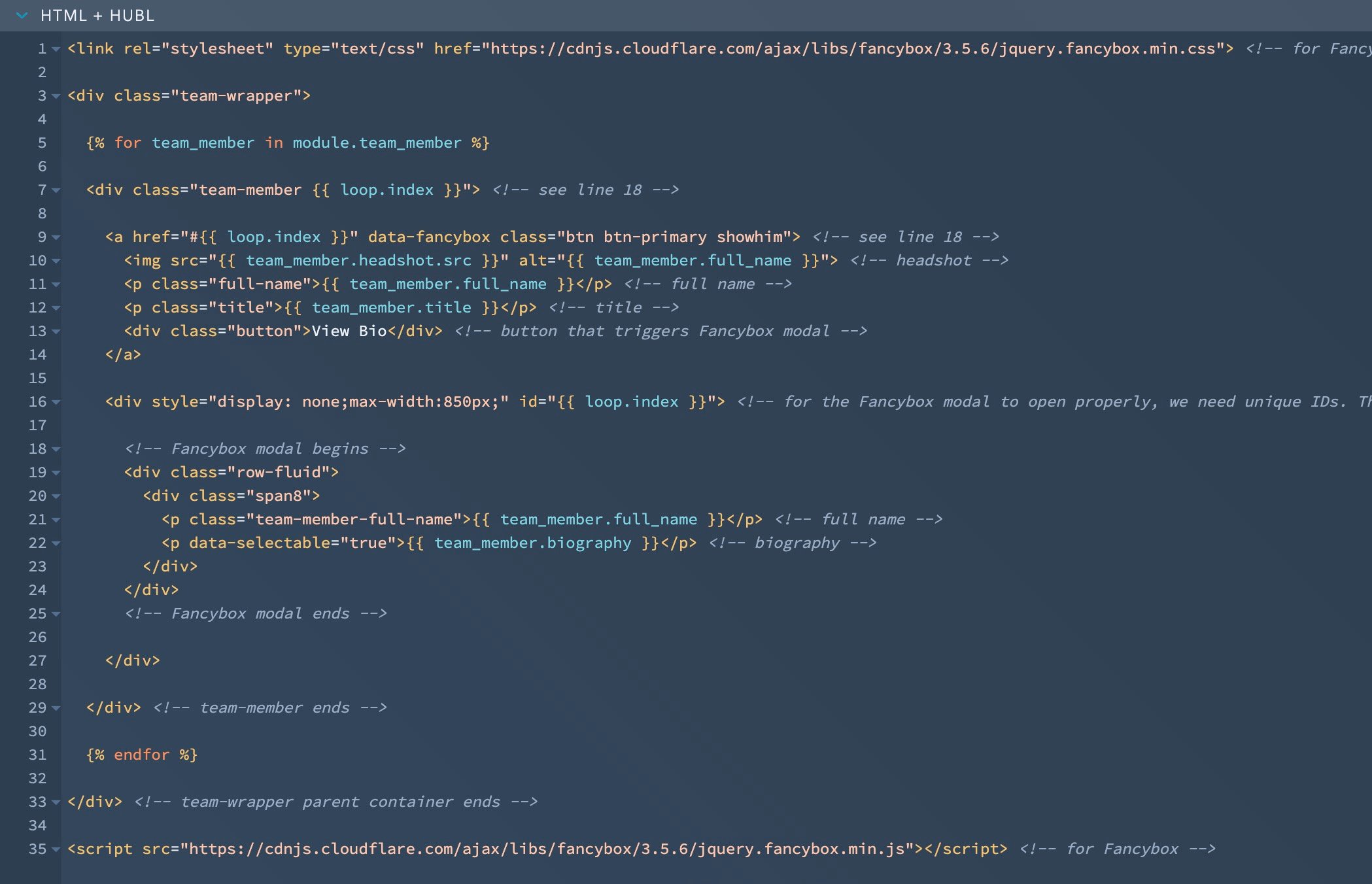
You can reference field option components as many times as you like. For example, we’ll pull in the team member’s name twice: once in the grid listing, and again in the modal popup itself.
As we pull in these components, we'll continue to add class names, HTML structure, and comments to our module so we know what's what. Now it’s starting to look something like this:
Step 4. Styling
You can add or edit CSS to match your website’s style. You can also add JS if your use case calls for it.
Preview your progress at any time by clicking the Preview button in the upper right-hand corner. This will open a Previewer window, where you can add dummy content and test that the right content is being pulled through and everything is styled as you want.
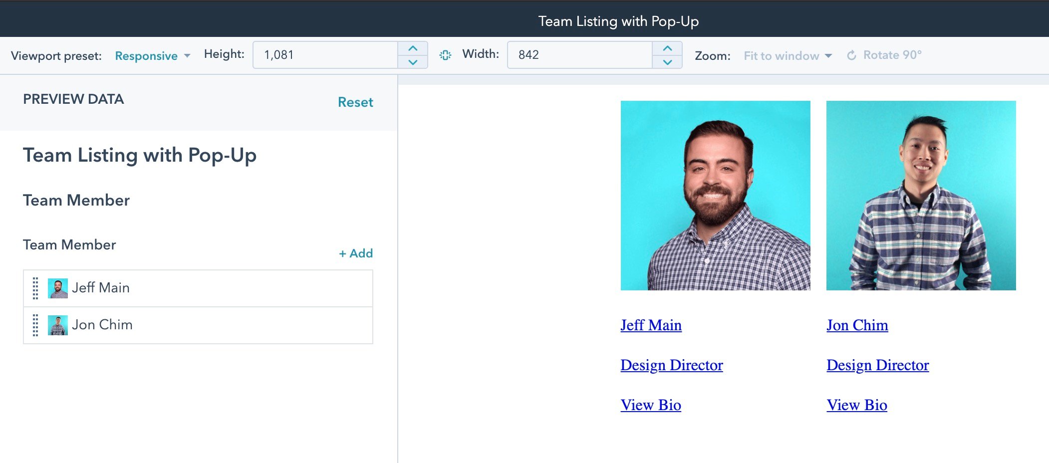
Note that your Preview mode is unstyled and will not pull through your website’s CSS stylesheets.
When you’re all set, go back to your Design Tools tab, and click the Publish button.
Step 5. Adding Your Module to Your Template
In Design Tools, navigate to the page template you’d like to add your module to. On the right-hand side, you can click “Add” and find your new module from the list! Then simply drag and drop it into your layout, and publish your page!
In your page editor, you can click the module as you would any other to add your content! The end result will look something like this, based on your website’s existing CSS:

Conclusion
The full code for this example can be found below. If you run into problems or want to learn more, HubSpot’s documentation is a great place to start, as well as the community HubSpot Developers Forum and Slack channel.
Have questions about this example? Drop us a comment below.
Happy coding!
HTML + HUBL
<link rel="stylesheet" type="text/css" href="https://cdnjs.cloudflare.com/ajax/libs/fancybox/3.5.6/jquery.fancybox.min.css"> <!-- for Fancybox -->

<div class="team-wrapper">

{% for team_member in module.team_member %}

<div class="team-member {{ loop.index }}"> <!-- see line 18 -->

<a href="#{{ loop.index }}" data-fancybox class="btn btn-primary showhim"> <!-- see line 18 -->
<img src="{{ team_member.headshot.src }}" alt="{{ team_member.full_name }}"> <!-- headshot -->
<p class="full-name">{{ team_member.full_name }}</p> <!-- full name -->
<p class="title">{{ team_member.title }}</p> <!-- title -->
<div class="button blue-btn">View Bio</div> <!-- button that triggers Fancybox modal; you can add an existing class here to match sitewide buttons, as we've done with "blue-btn" -->
</a>

<div style="display: none;max-width:850px;" id="{{ loop.index }}"> <!-- for the Fancybox modal to open properly, we need unique IDs. The use of loop.index numbers each repeater (1, 2, 3) so we have unique IDs -->

<!-- Fancybox modal begins -->
<div class="row-fluid">
<div class="span8">
<p class="full-name">{{ team_member.full_name }}</p> <!-- full name -->
<p data-selectable="true">{{ team_member.biography }}</p> <!-- biography -->
</div>
</div>
<!-- Fancybox modal ends -->

</div>

</div> <!-- team-member ends -->

{% endfor %}

</div> <!-- team-wrapper parent container ends -->

<script src="https://cdnjs.cloudflare.com/ajax/libs/fancybox/3.5.6/jquery.fancybox.min.js"></script> <!-- for Fancybox -->
CSS
.row-fluid .span8 {
  /*  this is a fallback container that ensures the Fancybox modal renders correctly */
  width: 100%!important;
}
.team-wrapper {
  /* the parent container on the module. This uses flexbox to align team members in a grid system */
  display: flex;
  flex-wrap: wrap;
  justify-content: center;
}
.team-member {
  /* to work with .team-wrapper. It's currently set as a grid of 4 across */
  width: 23%;
  margin: 1%;
  line-height: 1.5;
  position: relative;
  margin-bottom: 50px;
}
.team-member img {
  /* this styles the headshot image */
  width:100%;
  max-width: 200px;
  margin-bottom:10px;
}
.team-member .full-name {
  /* style the Full Name text */
  margin-bottom:0px;
  font-weight:700;
}
.team-member .title {
  /* style the Title text */
  margin-bottom:10px;
}
.team-member .button {
  /* style the View Bio button */
}

